Everybody has the right to a bank account
The inclusive alternative to traditional banks
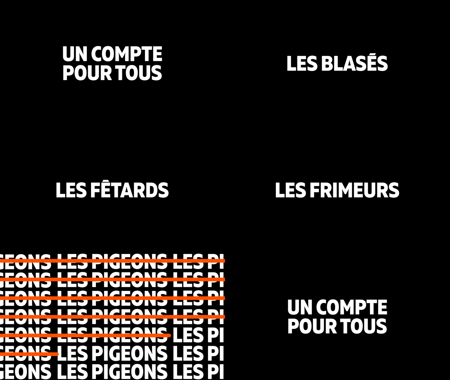
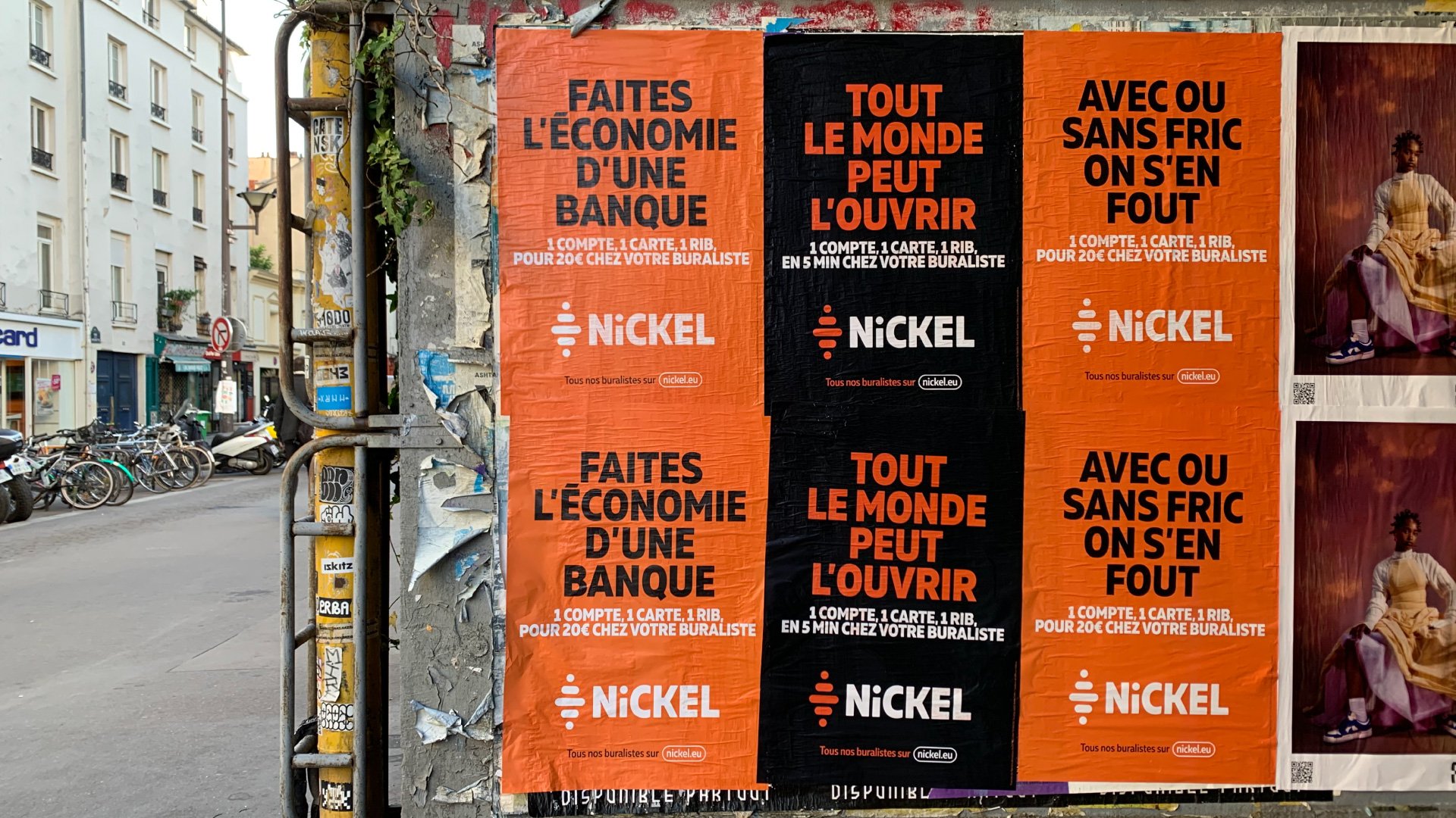
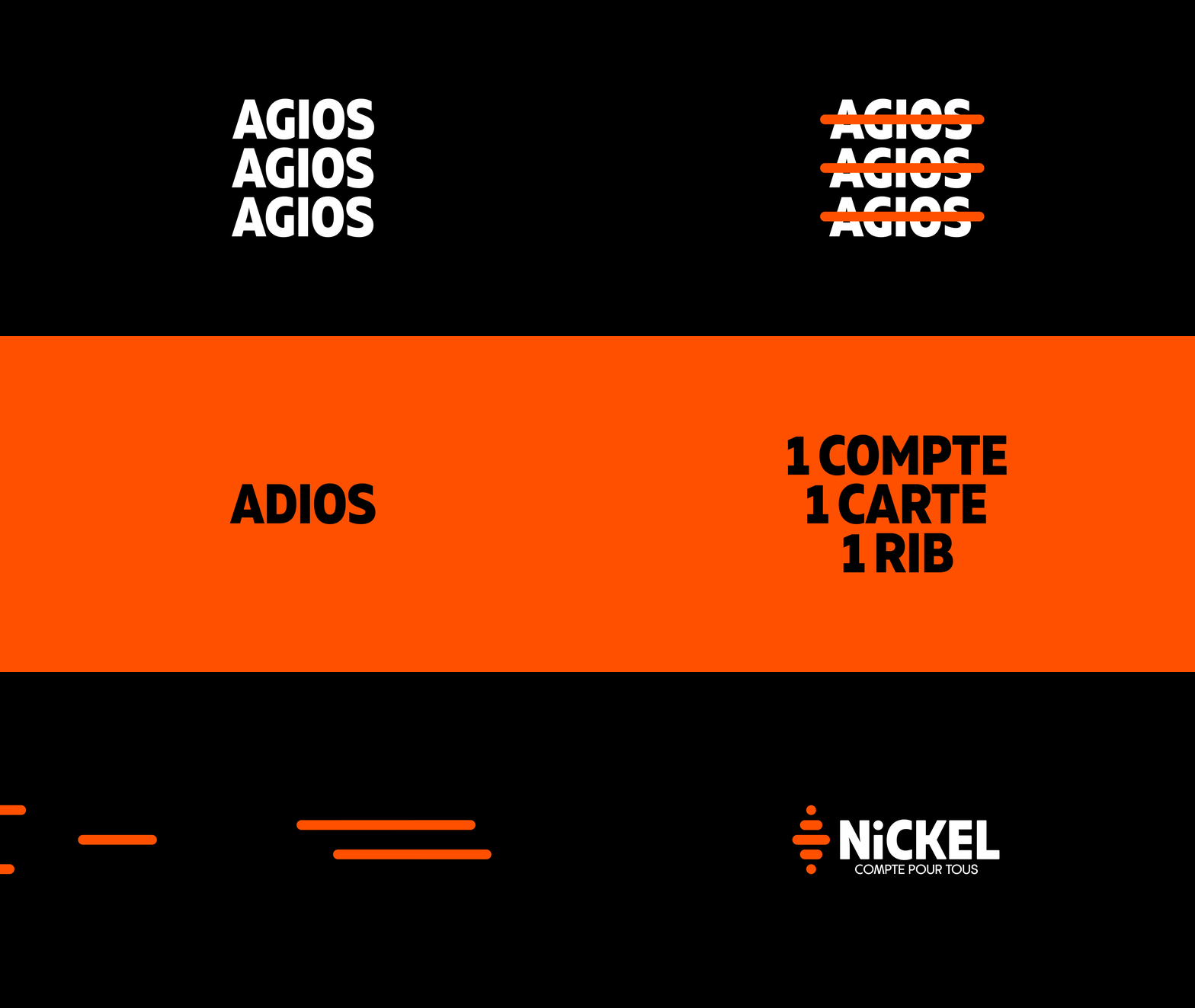
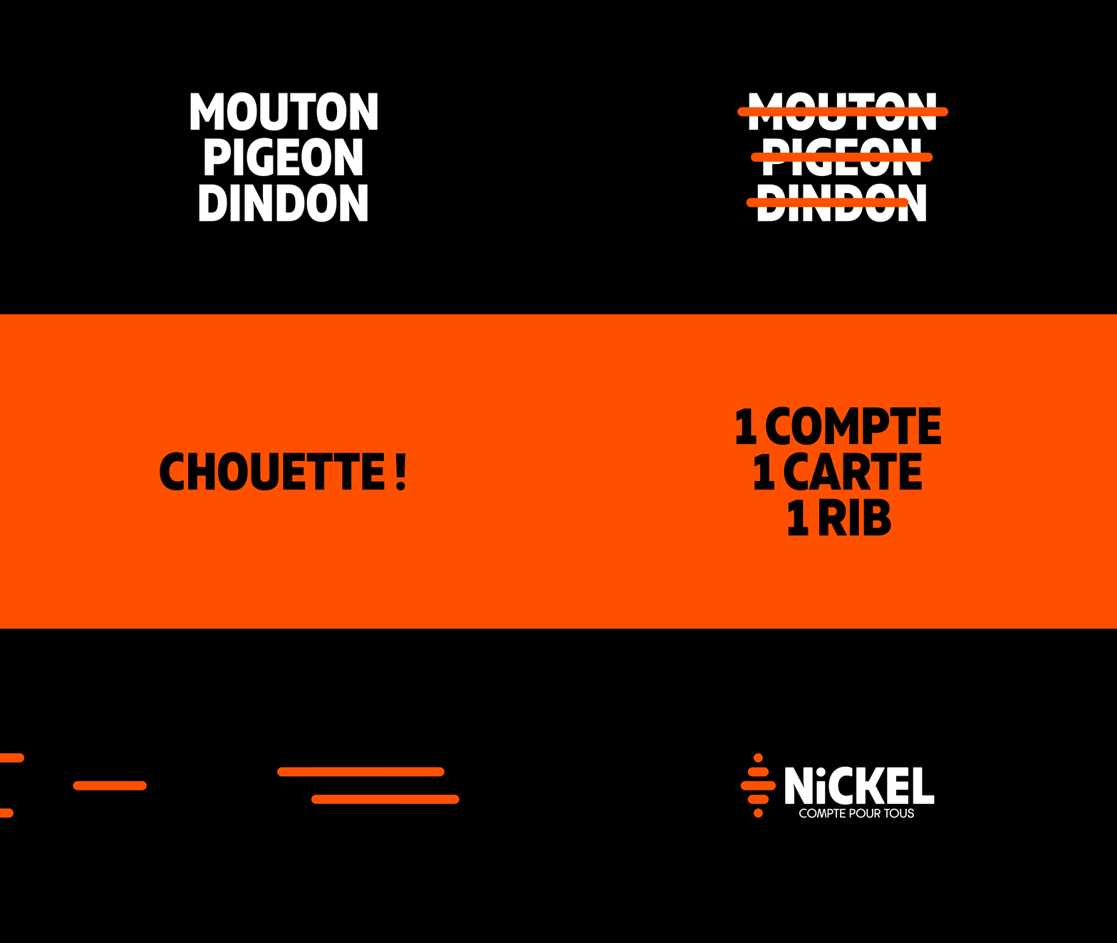
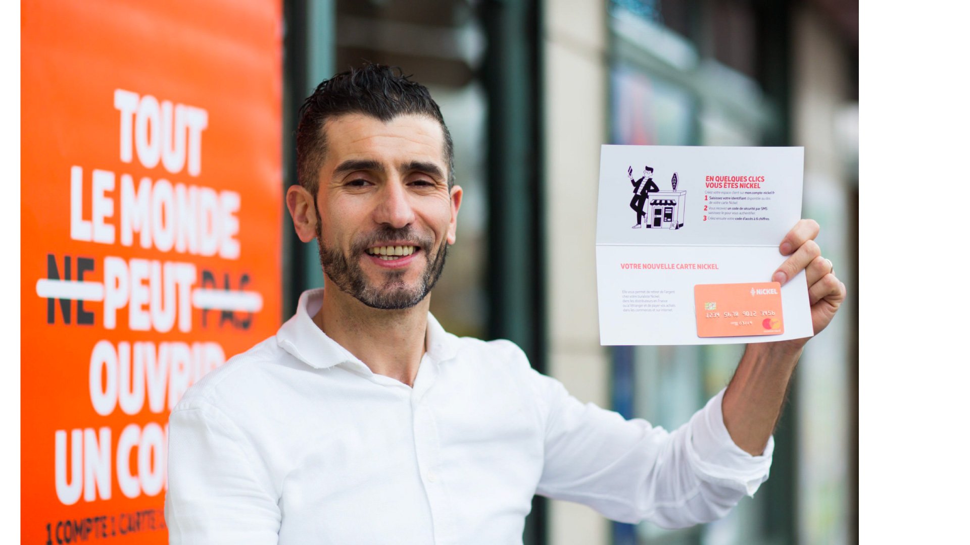
Nickel has revolutionised the banking industry by proposing an easy and accessible account for everyone, without the need for a bank. Our role at Royalties was to parallel the idea of inclusivity and disruption in the industry in the branding.

It all started with …
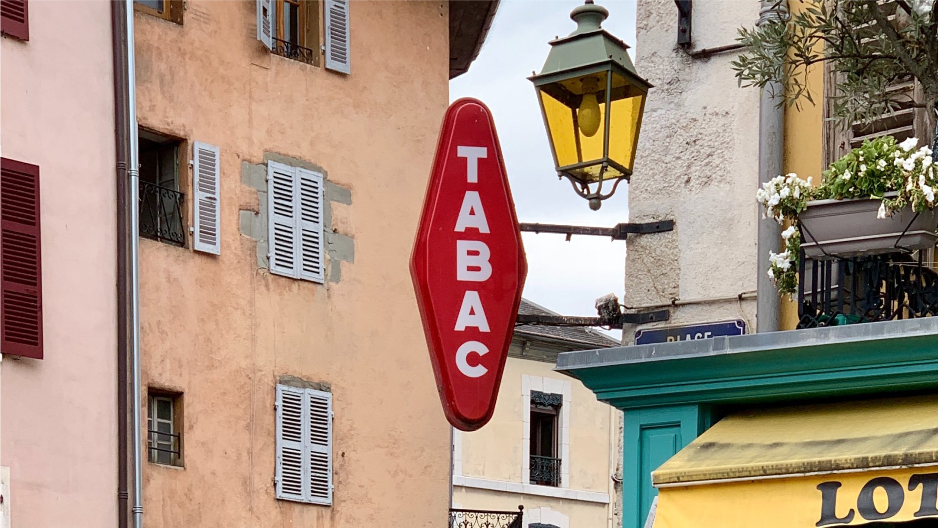
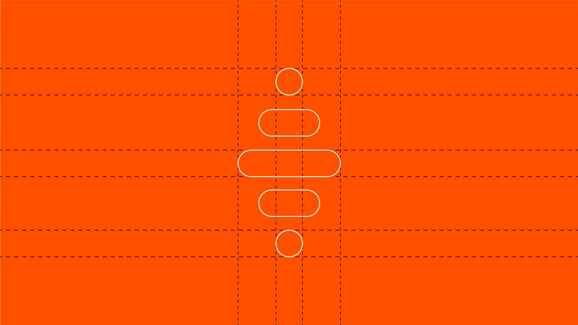
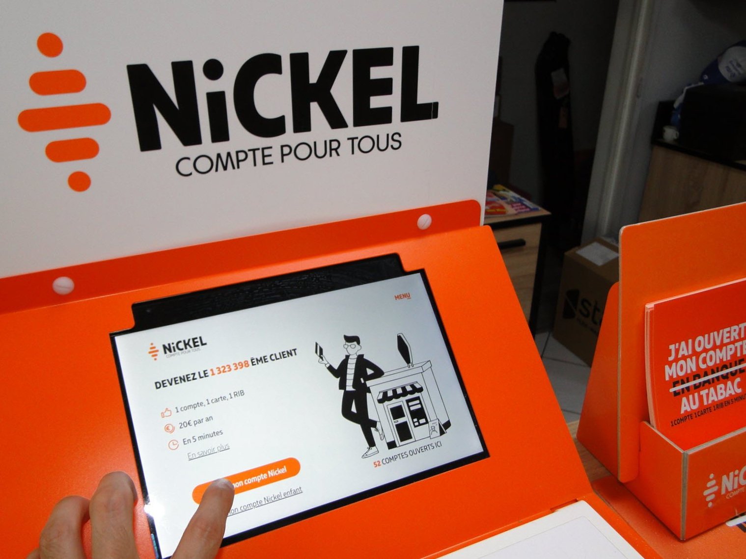
In designing the logo, we wanted it to be a potent symbol of Nickel’s heritage. The logo is in reference to an iconic sign found on tobacconists in France, the first partners of the brand, allowing anyone to open an account, anywhere.
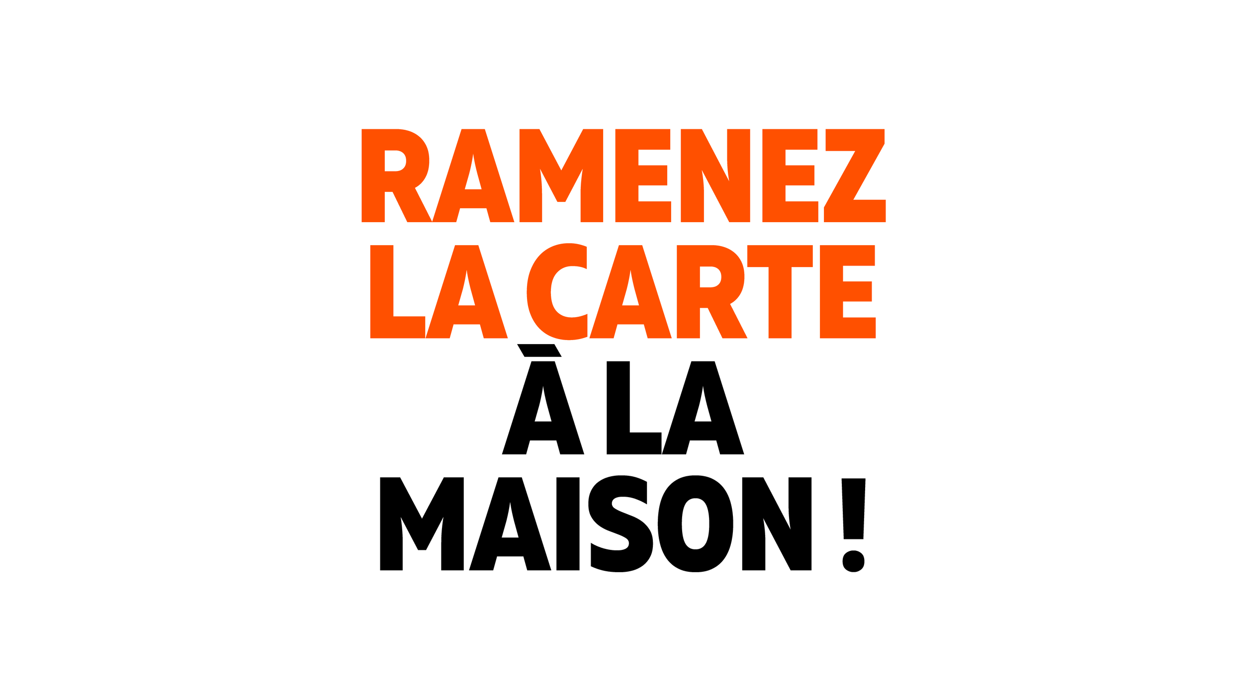
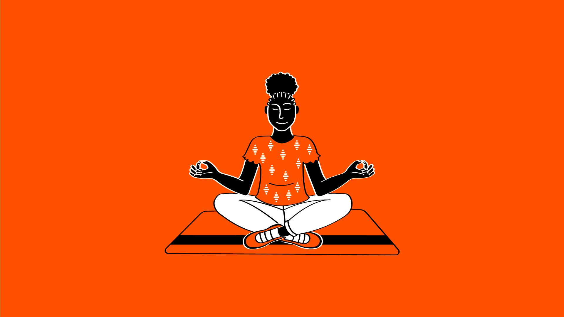
A brand that celebrates your small victories with you
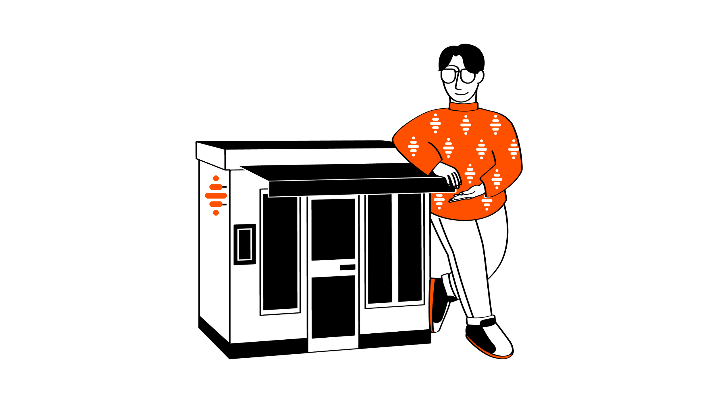
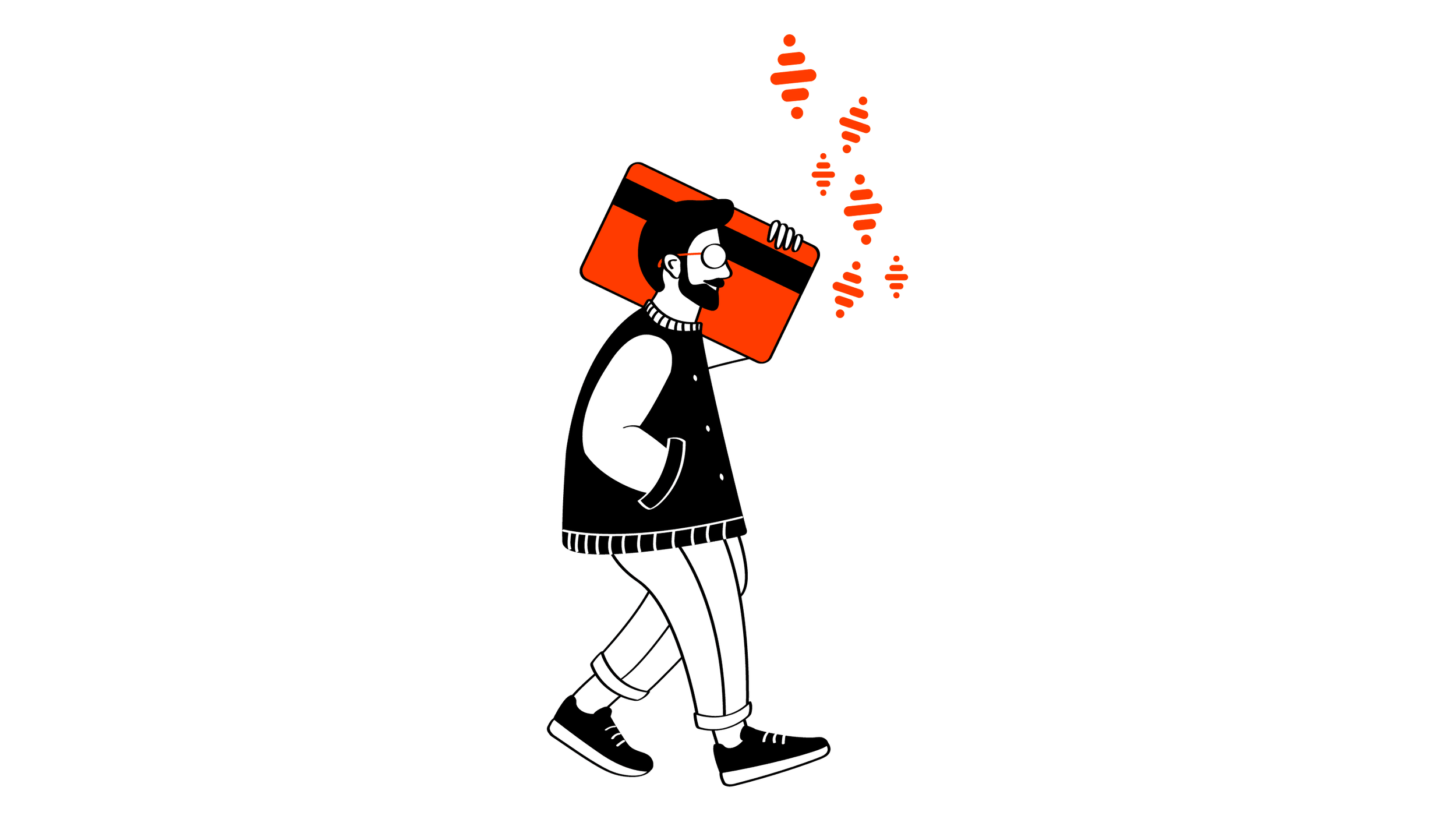
Nickel’s illustrations are just like the brand: always positive and inclusive. We designed them to be striking and light, promoting successful living made up of small victories, that sometimes go unnoticed but are nonetheless, meaningful.
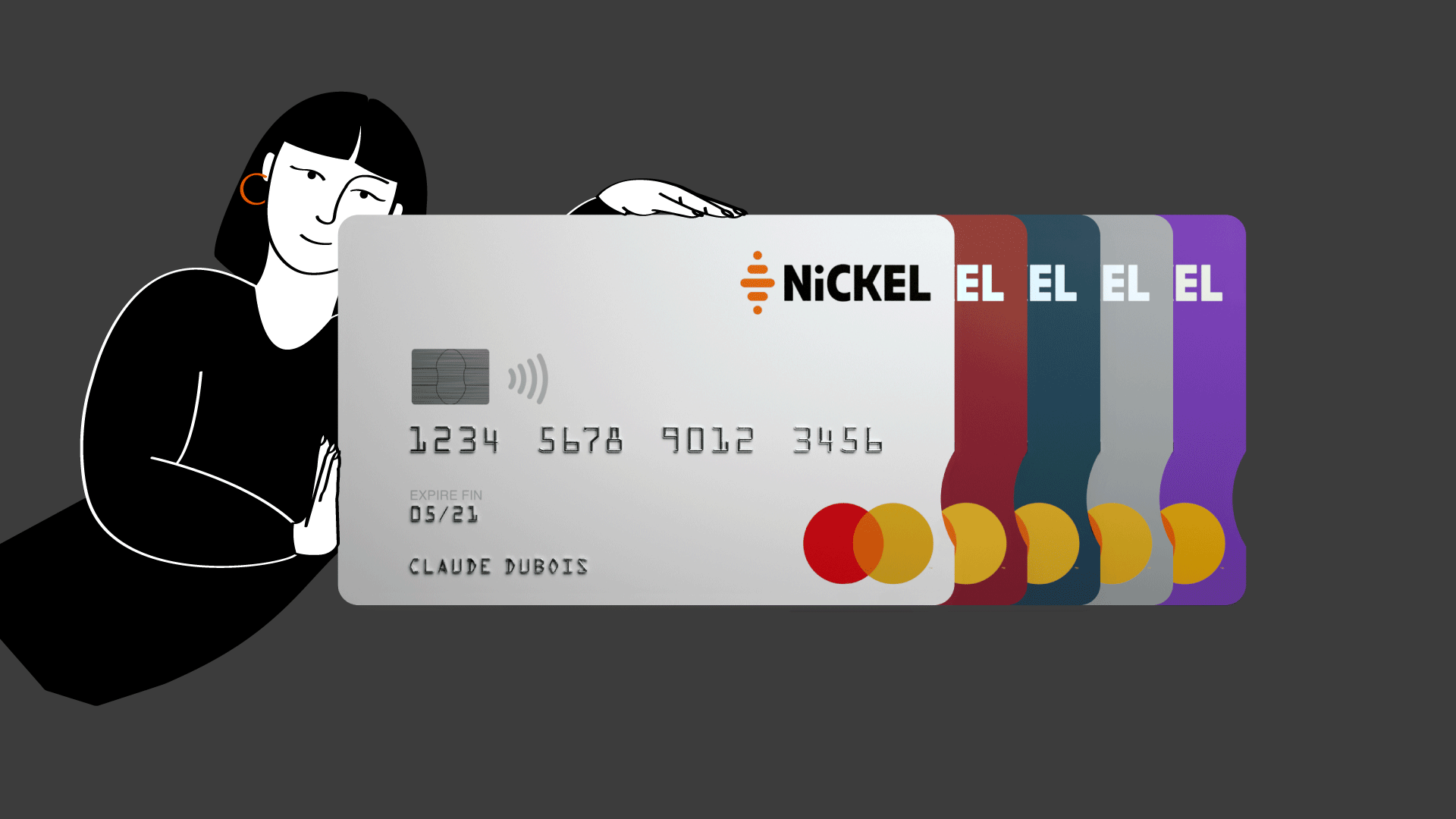
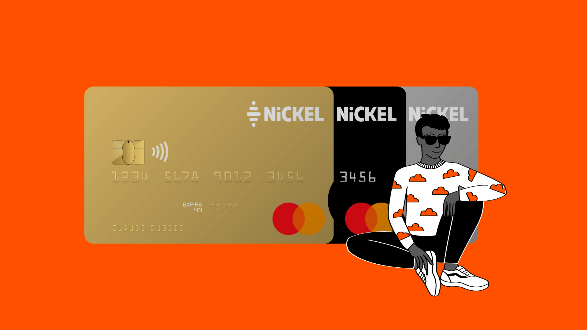
Bold cards for a bold company
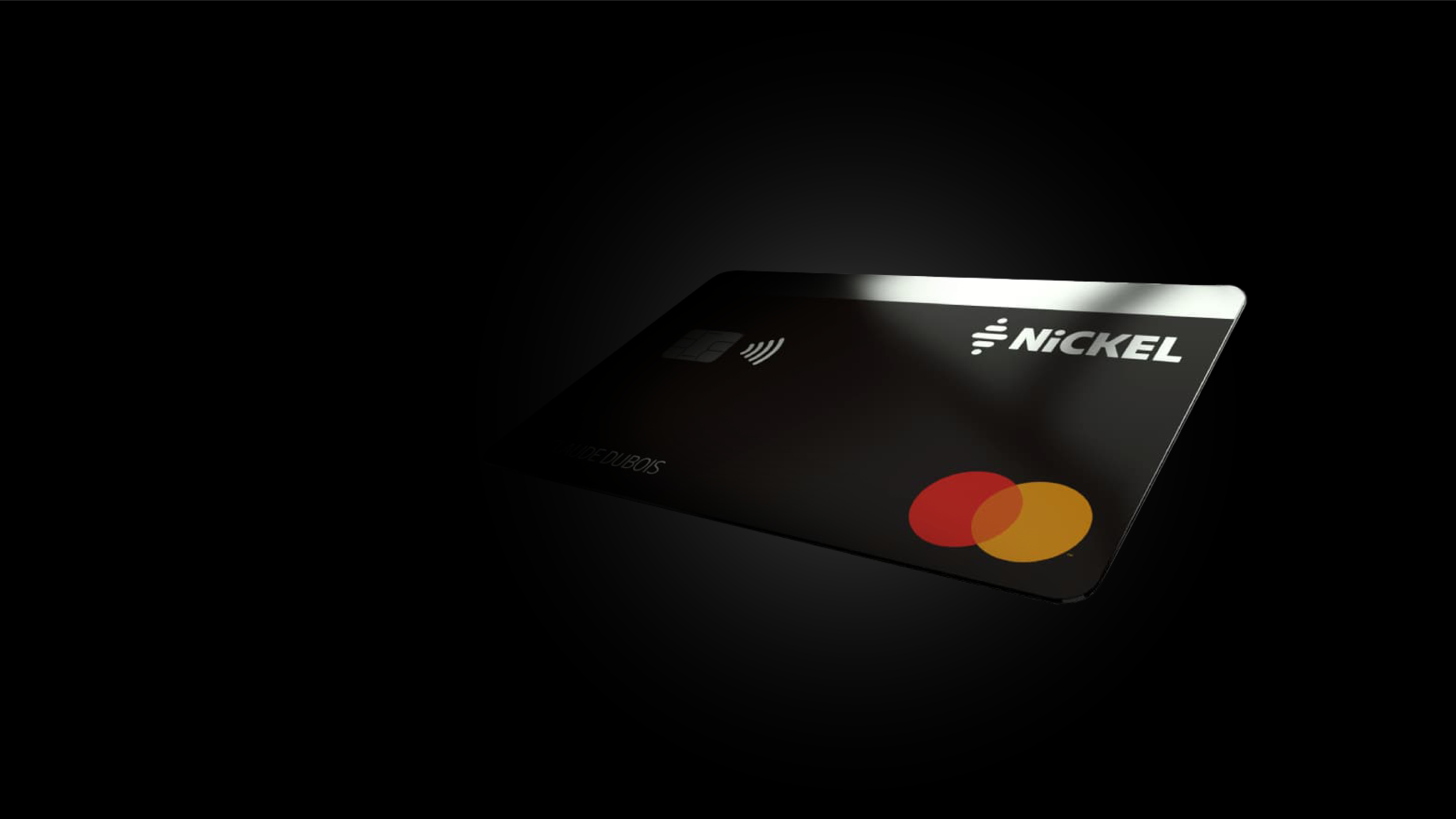
To reflect the personality of the brand, Royalties created their cards to be daring, bright, and easily recognizable. From standard cards in orange to platinum cards of metal, we made sure they all reflected Nickel.
Getting personal: Meeting the faces behind the brand
Putting faces to the names behind Nickel, we created a video series introducing the brand's employees: ON/OFF. A series of eight videos featured employees answering a mix of business-related and light-hearted questions, to express who they are and what they represent.
« From rebranding to branding to advertising, our challenge was to cohesively manage all the expression of Nickel, in France and abroad »
Laure-Anne Pachet, Royalties' Managing Director
This web page is Eco Report : 🄰


